Remittance Statistics: Highlights
Who Depends Most on UK Money?
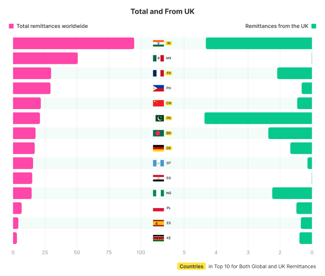
Globally, India is the no.1 remittance giant (roughly £95bn of total inflows), with Pakistan coming in substantially lower (roughly £21bn).
However, when it comes to remittances from the UK, Pakistan edges India with an inflow of £4.24bn vs £4.17bn in 2025.
That’s despite a smaller Pakistan community too. Showing they are, on average, more financially tied back home than India's UK migrants.
Combine them, and you’re looking at over £8.4bn in remittance outflows from the UK to just two countries.
Total remittance inflows vs. money sent from the UK
Of the largest remittance receiving countries, Kenya is the most UK-dependent. Kenya’s inflows from the UK were roughly £0.81bn out of £3bn, or about 27%.
That’s even higher than Pakistan’s UK share (£4.24bn out of £21bn, about 20%).
A significant £2.08bn from the UK to France is a reminder that these flows are not just to developing economies. A lot of UK-to-France money will be property-related transfers and families living across two systems.
Private Money vs Public Support
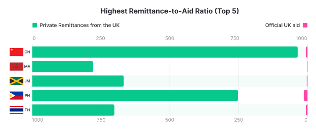
Where remittances dwarf aid (as in China and Thailand), it usually comes down to two things.
First, these corridors tend to have large, settled diaspora communities earning in the UK.
Second, the recipient countries are not major UK aid priorities, because the need is less acute than in the biggest humanitarian crises.
Private remittances vs. government aid from the UK (GBP millions)
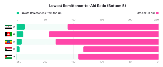
When aid far outstrips remittances, the pattern flips.
The West Bank & Gaza is a clear current-events outlier. In 2025, the UK recorded just £1.0m in remittances versus £137.9m in UK government aid, roughly a 138x gap.
It’s not that people in the UK aren’t sending money. Much of the money sent is simply flowing via government aid and charities, because direct transfers have been harder to execute.
Providers apply strict counter-terrorism screening (Hamas is a UK-designated terrorist group), and the Palestinian banking system has faced severe operational disruption.
While it’s in neither the highest nor the lowest ratio, Ukraine stands out too.
With £725.2m in remittances and £269.68m in UK aid, it shows a growing diaspora and government support responding to the same trigger, an ongoing war
Per Migrant, the UK’s Remittance Story Reorders Itself
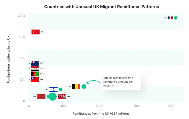
Looking at the size of the migrant population and total value sent, we can calculate the volume sent per migrant.
In this regard, Bermuda is in a league of its own.
With £299.78m sent from just 11,266 foreign-born people, that’s roughly £26,609 per migrant. It’s a small base, likely skewed by higher incomes and occasional large property or wealth transfers.
Migrant population vs. remittances from the UK
At the other end, Afghanistan sees £11.97m sent across 99,398 people, or £120 per migrant. Iraq is similar at £12.58m across 99,203 people, or £127 per migrant.
Both corridors are likely dragged down by lower sending capacity, strict risk controls, and patchy banking routes, so more support may flow via charities or informal channels rather than direct transfers.
New Zealand is low too, but for different reasons. With £1.39m sent across 89,003 people, it fits a wealthier home economy and a UK-based community more likely to keep finances in the UK.
Where the UK’s Remittances Matter Most
This is the closest thing to an “impact” lens.
A £2,000 transfer means something very different depending on the economic baseline of the country receiving it.
Nigeria receives on average 12.2x more in value per migrant compared to local GDP.
For many, these funds are likely crucial for survival, but the amount sent per migrant is likely inflated by a small number of very large transfers from high-earning or wealthy individuals.
Money sent to Yemen and Pakistan is also proportionally high at 8.1x and 5.6x local GDP respectively.
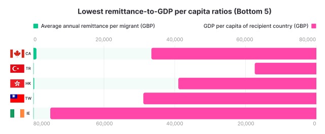
Remittances per migrant vs. GDP per capita of recipient countries (GBP)
On the other end of the spectrum, the average amount transferred per migrant to Ireland equates to just 0.002% of local GDP.
The remittance “need” just isn’t the same, and funds are managed in a different way through things like multi-currency accounts and overseas investments.
The UK’s Past, Still Written Into Today’s Remittances
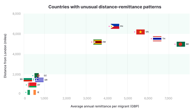
Distance isn’t the standalone story here. History plays a significant part too.
Some of the strongest “send-per-migrant” corridors are thousands of miles away, demonstrating how far Britain’s ties still reach.
Bermuda is again the extreme case. A British Overseas Territory, a global finance hub with no income tax, and a tiny UK-linked population base. That’s why it comes out at £26,609 per migrant.
Distance from the UK vs. remittances per migrant
There is a European skew too.
Belgium (£15,756) and France (£10,918) show significant flows, while parts of the Middle East and Asia are far lower per migrant: Iraq (£127), Afghanistan (£120), Taiwan (£109), and Turkey (£90).
From 0.4% to 38%: The Gap in Income Sent Home
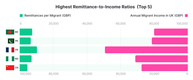
Bangladesh migrants send the highest percentage of their earnings back home. An average of £7,668 per migrant from £20,124 income (38.1%).
This is followed by Pakistan, where an average of £6,024 is sent per migrant, compared to an average income of £23,530 (25.6%).
France is also notable. An average of £10,918 was sent per person from an average income of £47,678 (22.9%), pointing to close ties between families living across the two countries.
Annual income vs. remittances per migrant
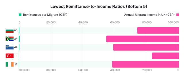
By contrast, a very small proportion of earnings are sent home to countries like South Africa and Greece (1.8% and 1.1% respectively).
Ireland and Turkey are again extreme outliers (0.5% and 0.4% respectively).
Methods
We built a country-by-country dataset describing money sent from the UK, and how it compares with aid, migrant community size, and other context measures. Bilateral remittance outflows from the UK by destination were taken from the World Bank/KNOMAD bilateral remittance estimates (latest year with full bilateral detail). Where a destination corridor was missing, we filled gaps using figures reported in major local media that cite the recipient country’s central bank publications (typically balance-of-payments or remittance reporting), then aligned those values to the same corridor definition.
Because key inputs are reported in different years, we standardised all monetary series to 2025 equivalents. Remittance flows were uprated from their source year to 2025 using World Bank remittance growth factors by region, with adjustments by recipient income group where applicable. UK official development assistance (ODA) by recipient country was taken from the UK government’s 2023 outturn and inflated to 2025 using annual inflation factors. Migrant earnings by nationality were sourced from ONS-based Migration Observatory analysis and grown to 2025 using average UK salary growth.
All monetary values were converted to GBP using an average 2025 exchange rate. Migrant-stock denominators were compiled as a combination of sources, with ONS as the primary reference and supplementary official sources used where needed. Per-migrant measures were calculated by dividing corridor remittances by the corresponding UK-resident migrant population.
To reduce volatility from very small corridors, we excluded destinations below minimum size thresholds. In general, this removed corridors with very small remittance totals (typically below £1m) and/or small migrant communities (typically below 10,000), with stricter cut-offs applied in some comparisons (for example, GDP-per-capita panels used a higher remittance minimum; aid and passenger panels required minimum aid and passenger volumes).

